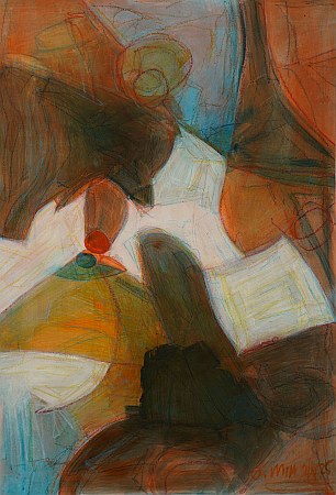
Colour and Value Transition Study No. 10 (2025)
By Osman Mia
16x23 inches, acrylic on paper
Continuing the "Colour and Value Transitions" series, I completed the third batch of four abstracts. For this batch, each piece has different amounts of light vs dark areas.
This piece - the second from the batch - is about 30% dark and 20% light areas. It's a good balance with satisfying contrast.
